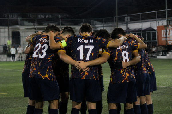
Every World Cup is a tournament within a tournament. Alongside the goals, the upsets, and the inevitable penalty drama, there's a quieter competition playing out — one decided before a ball is kicked. Which nation showed up wearing something genuinely special?
In 2026, the standard has been unusually high.
The standouts
Japan's away kit has been the most talked-about shirt of the tournament, and for good reason. At first glance it's deceptively simple — thin broken coloured stripes on a white base — but the details reward closer inspection. There are twelve stripes in total, one for each player on the pitch plus one for the fans, and a single red line placed at the centre echoes the red sun of the Japanese flag. It's the kind of design that looks clean from the stands and reveals its meaning when you look closer. Unsurprisingly, it topped a fan vote at Footy Headlines before the tournament had even started.
Morocco have arguably produced the most original cut of the tournament. What looks understated at first — a subtle texture, a central crest — reveals itself slowly: an unusual buttoned granddad collar, green highlights, and traditional embroidered taping around the collar and cuffs that blurs the line between sportswear and dresswear. It feels less like a football shirt and more like a garment.
Côte d'Ivoire went in the opposite direction — bold, unapologetic, and impossible to miss. Their home shirt takes the classic vibrant orange base and layers an animal print across it, with green flashes on the side panels. It shouldn't work as well as it does.
And then there's Argentina. The home shirt keeps their famous sky blue vertical stripes but introduces gradient shading as a tribute to their three World Cup victories — each blue stripe fading from lighter to darker, paying homage to the shirts worn in 1978, 1986 and 2022. It's a masterclass in doing something subtle with something iconic.
What the best kits have in common
Looking across the tournament's standout designs, a few things emerge consistently. The best kits tell a story that goes beyond the colours. Japan's stripes count players. Morocco's collar references craft traditions. Argentina's gradient carries history. Even at the highest level, the brief isn't just "make it look good" — it's "make it mean something."
The other thing they share: restraint. Not minimalism exactly — Côte d'Ivoire's animal print is hardly restrained — but intention. Every element earns its place. There's no decoration for decoration's sake.
What this means for your team
This is the thing that often gets lost in conversations about grassroots kit design: the same principles apply at every level. A strong base colour, one or two accent tones, a logo or crest that means something to the people wearing it. That's it. That's the whole formula.
Your team doesn't need a three-year design process or a contract with Adidas to end up with something you're proud of. You need a clear idea of who you are and what you want to represent — and then a way to get that onto a shirt without the design getting lost in translation between your group chat and the final product.
That's exactly what we built Kraniq for. Whether you've got a finished design ready to go, an idea you want to develop, or you'd rather start from one of our existing styles and make it yours — the goal is the same one Japan, Morocco, and Argentina's designers started with: a kit that means something to the people wearing it.
The World Cup sets the standard. The rest of us get to take the inspiration wherever we can find it.